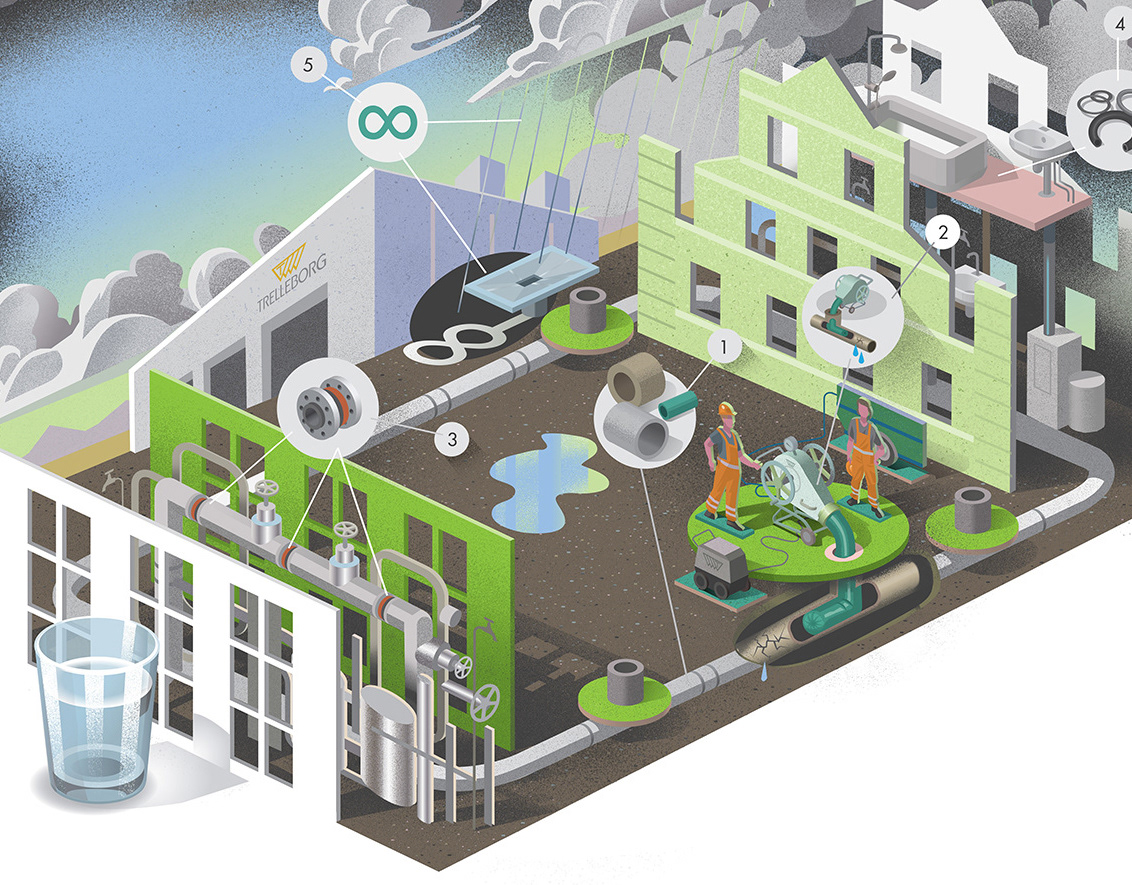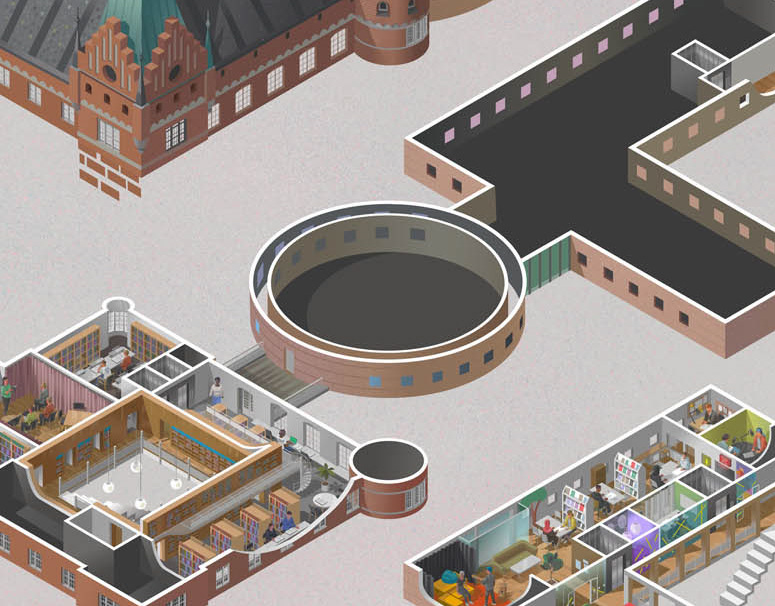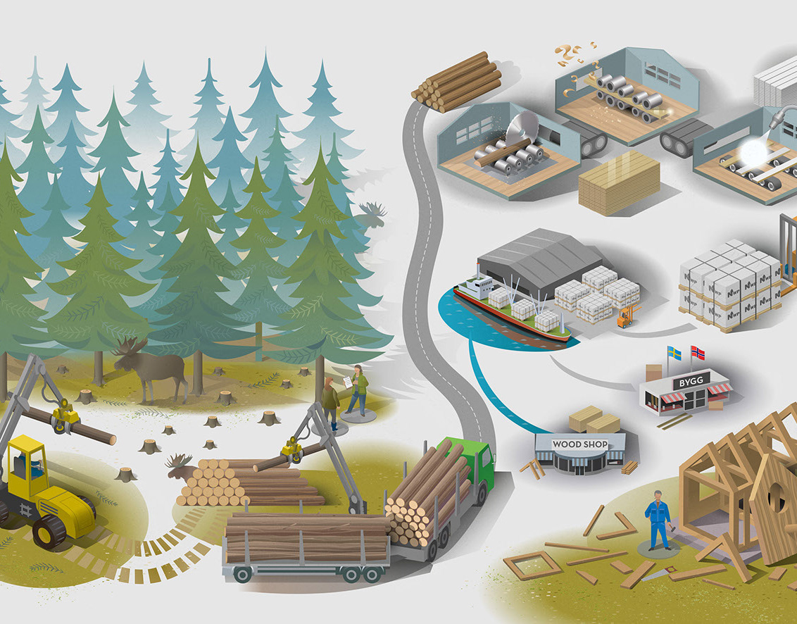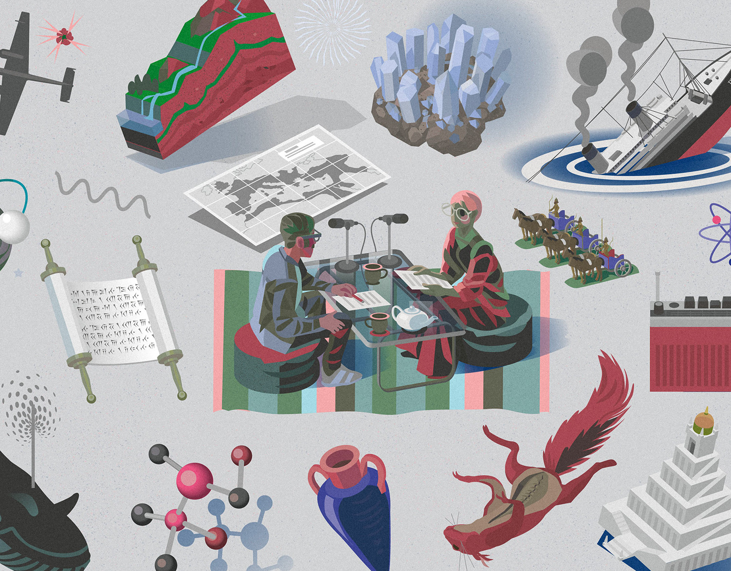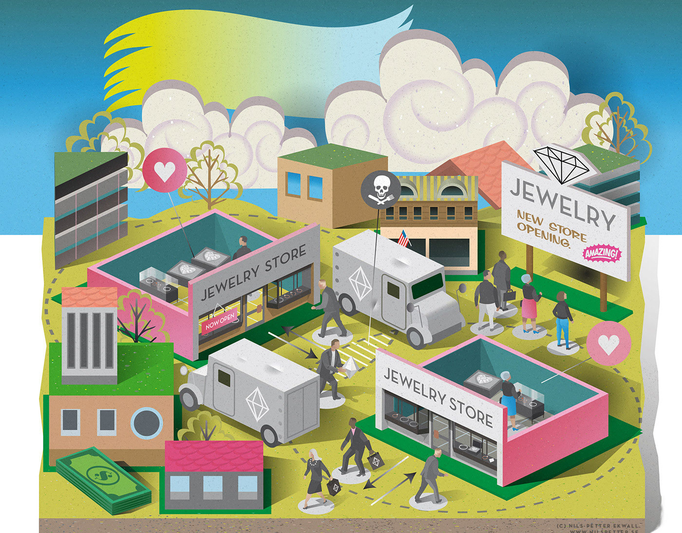
Editorial illustration by Nils-Petter created for a magazine feature and the article “Teaching That Makes a Difference Beyond the Classroom,” exploring how education can make a difference in society. The project is part of an ongoing editorial collaboration with the publication.
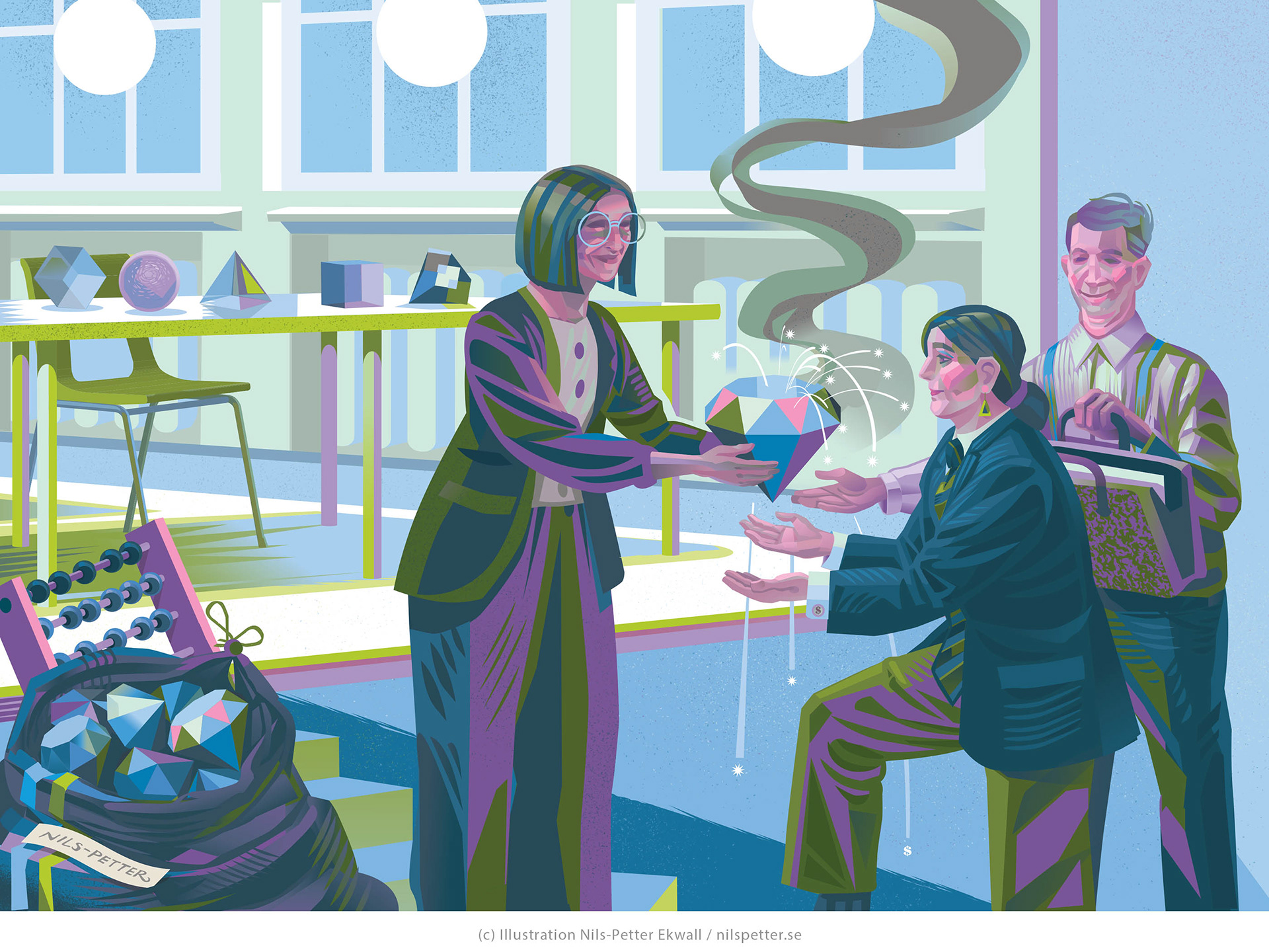
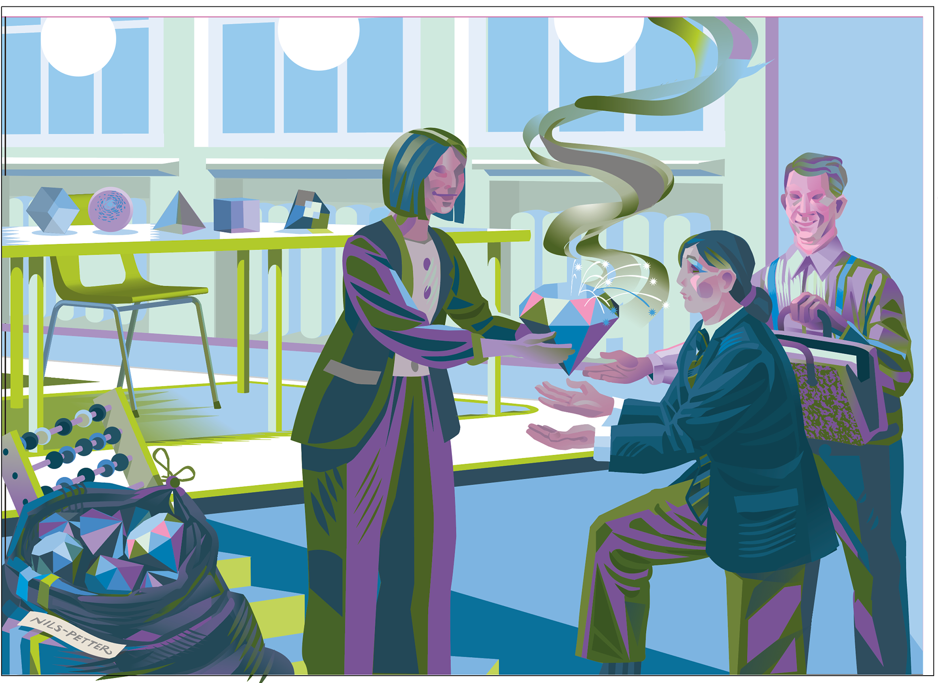
Final illustration!
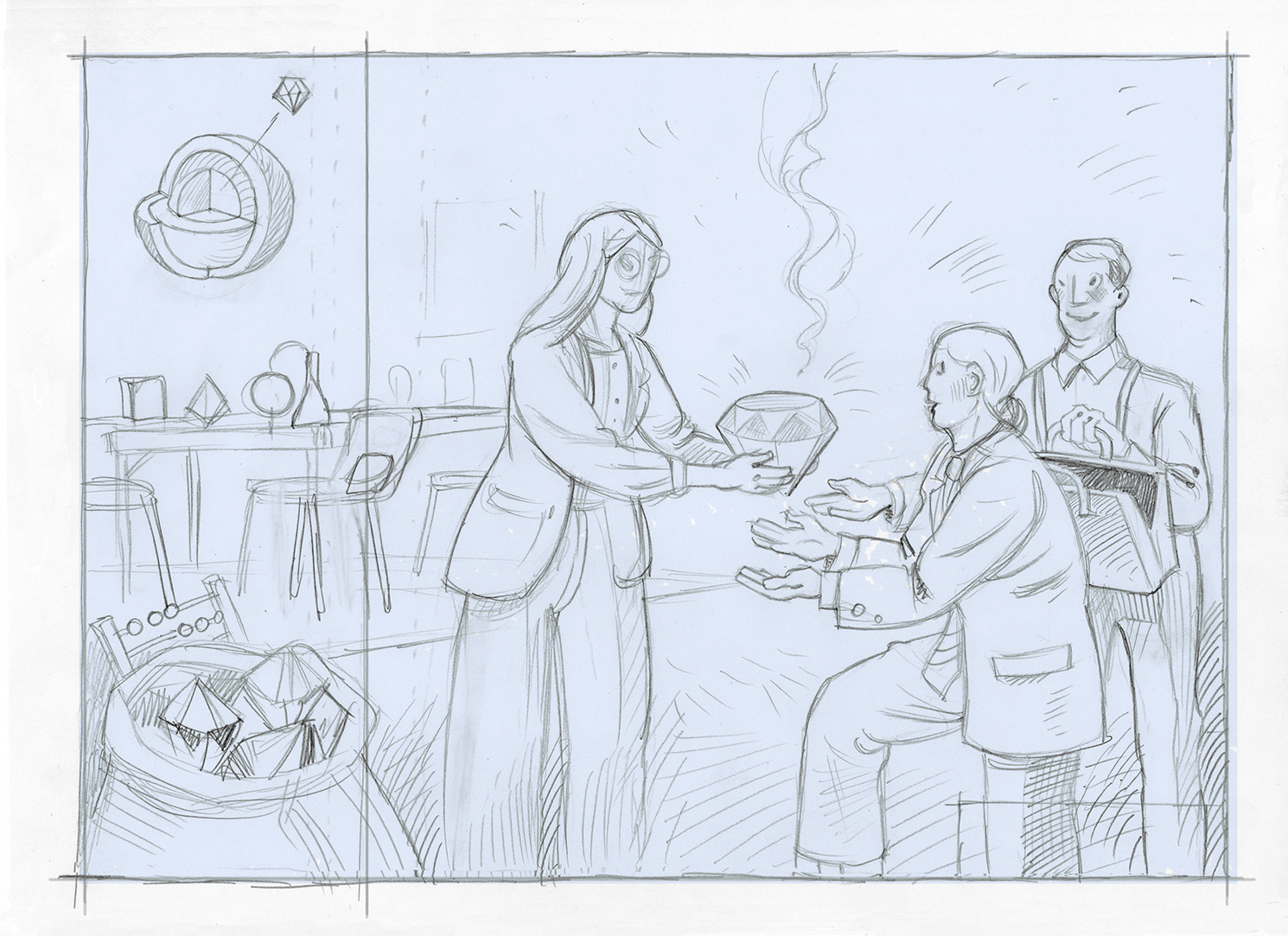
Concept sketch. The starting point for this illustration was the idea of creating a visual connection between education and value. A diamond was considered as a possible visual symbol for value, combined with a classroom or learning environment in the background. To make the composition work with the magazine format, the classroom was lifted into the air and transformed into a floating architectural element. The composition was also structured around the centre fold, keeping the important elements clear of the gutter.
For this type of assignment, the article is supplied together with the finished spread layout. As part of an ongoing editorial collaboration, this particular client gives considerable creative freedom to explore the visual concept and develop an illustration that responds to both the content and the format.
Nils-Petter often approached the illustrations for the articles in this series as narrative scenes with a slightly surreal quality. The process usually starts with a simple concept sketch or several thumbnail ideas, allowing the editorial team to review the direction before the final illustration is developed.
The series often has a preference for a light blue colour tone or background, while the visual concept and storytelling remain largely open for the illustrator.
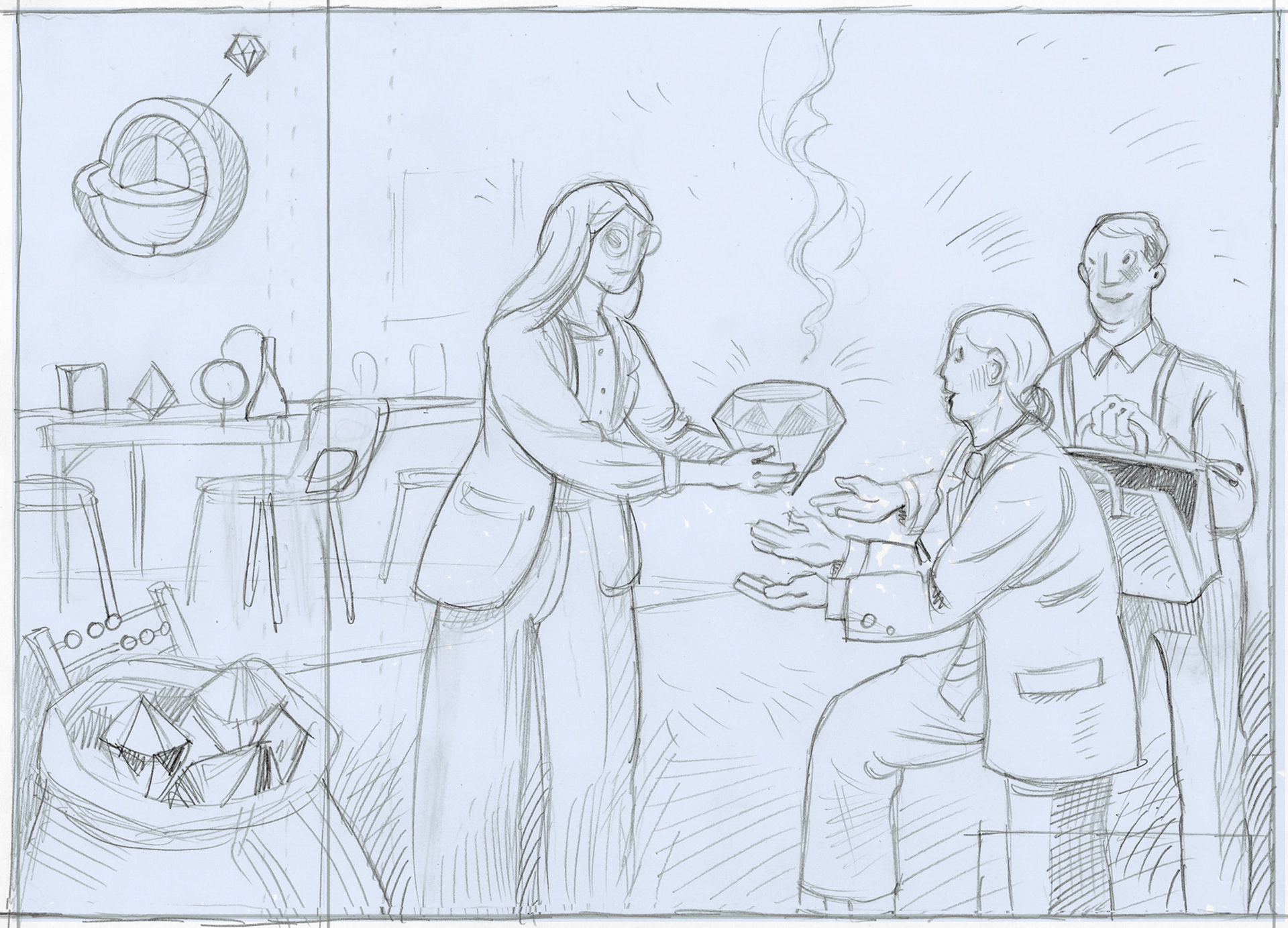

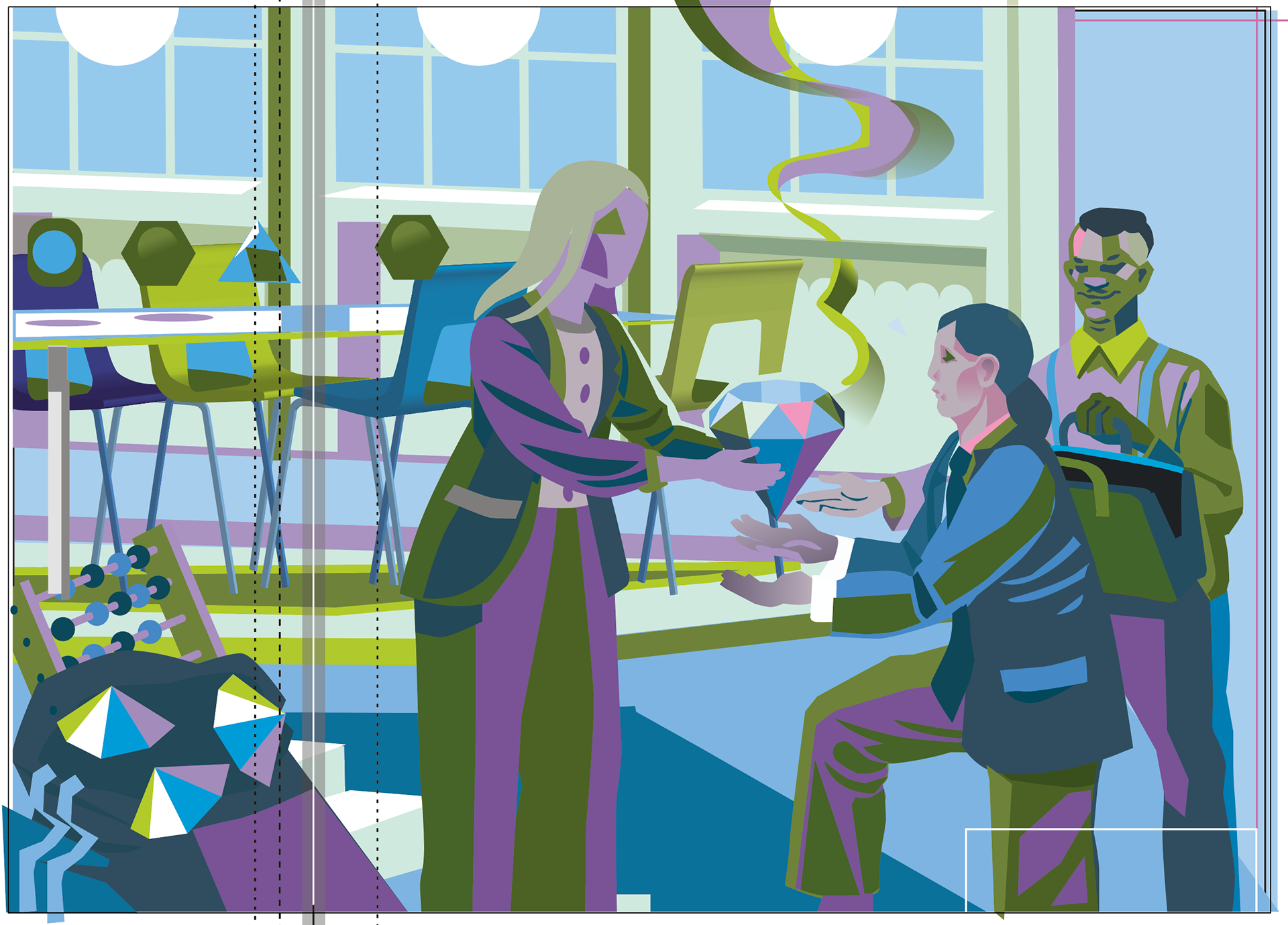
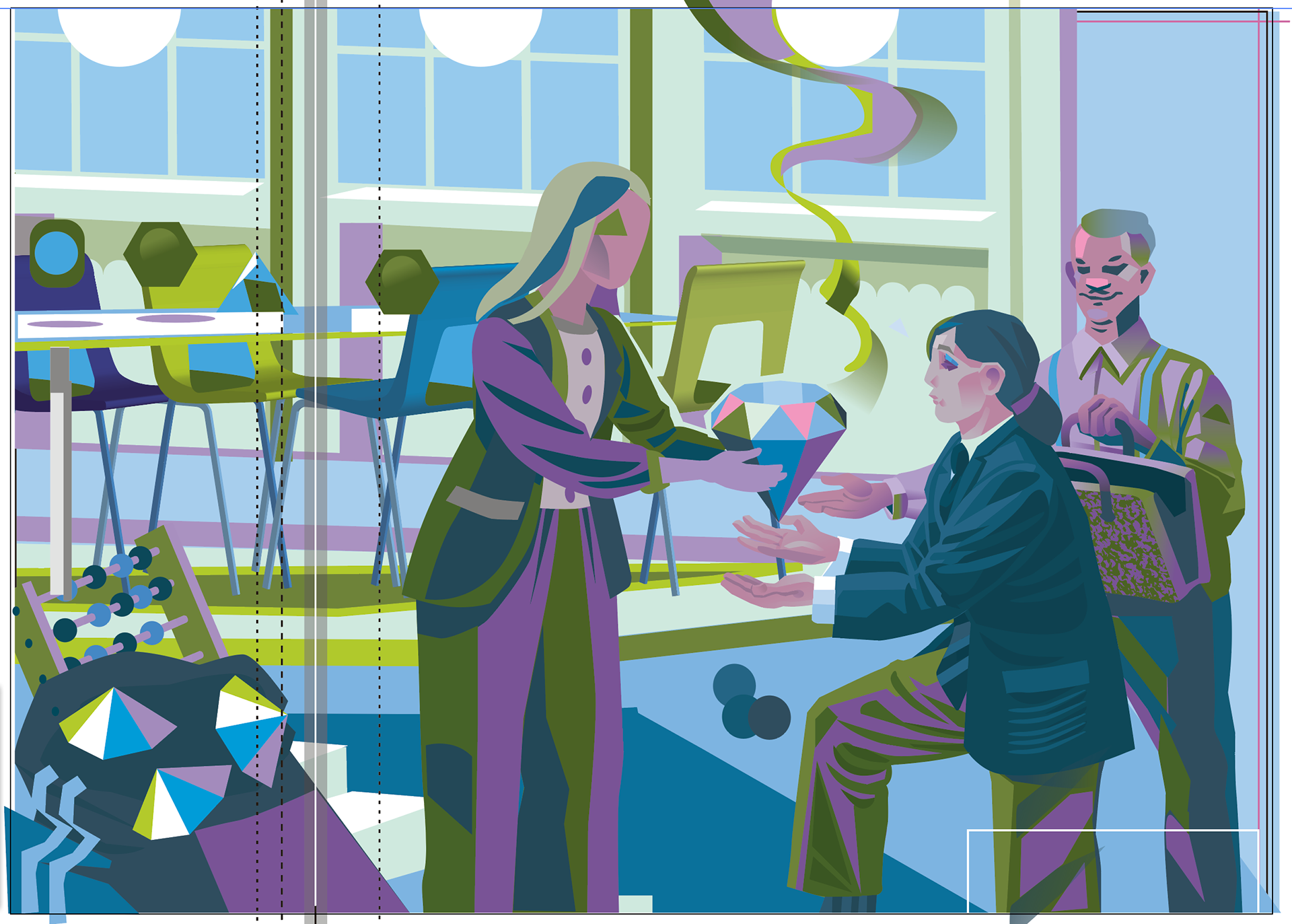
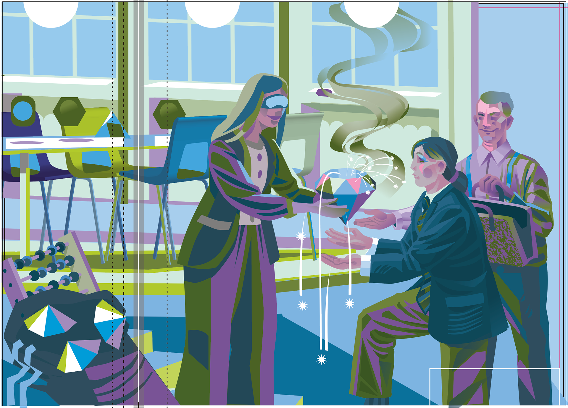
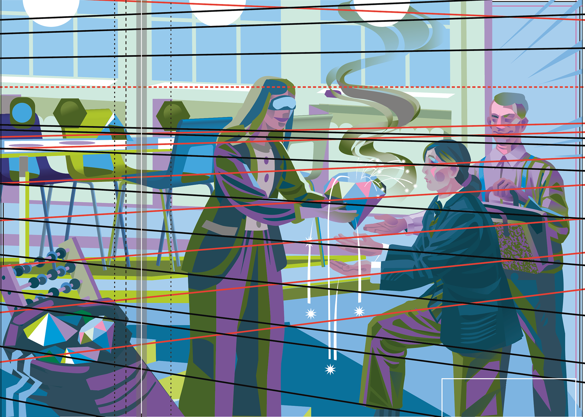
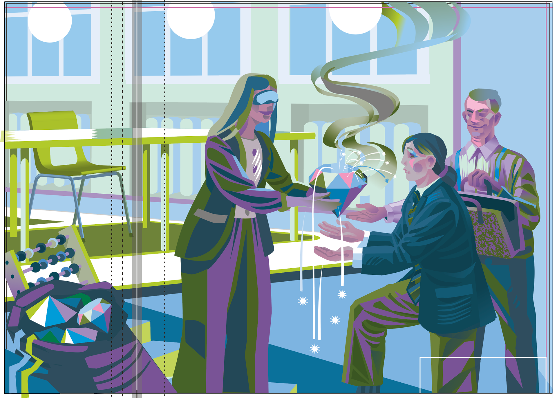
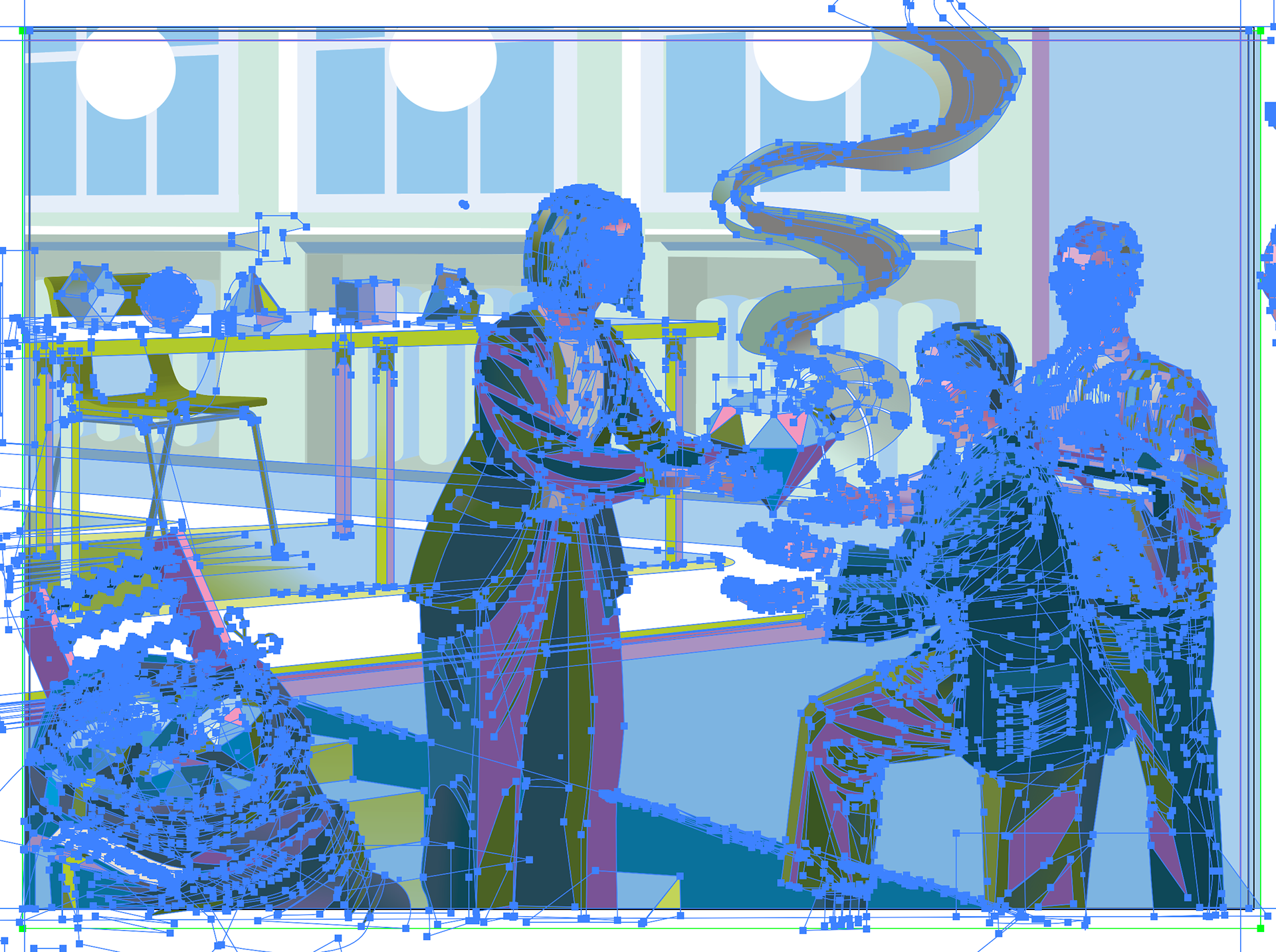
1–9 Above: Illustration process.
After the concept sketch was approved Nils-Petter started by building up the image with simple vector shapes based on the sketch, gradually rendering the illustration section by section into the final level of detail. The colour palette initially had one clear requirement: light blue. Moss green was introduced by Nils-Petter as a complementary colour, while the rest of the palette developed organically during the illustration process in Illustrator.
Halfway through the process (6), Nils-Petter had to set up perspective guide to refine and correct the perspective throughout the scene. The composition and characters developed organically along the way, with hairstyles, clothing and other visual details changing as the illustration evolved.
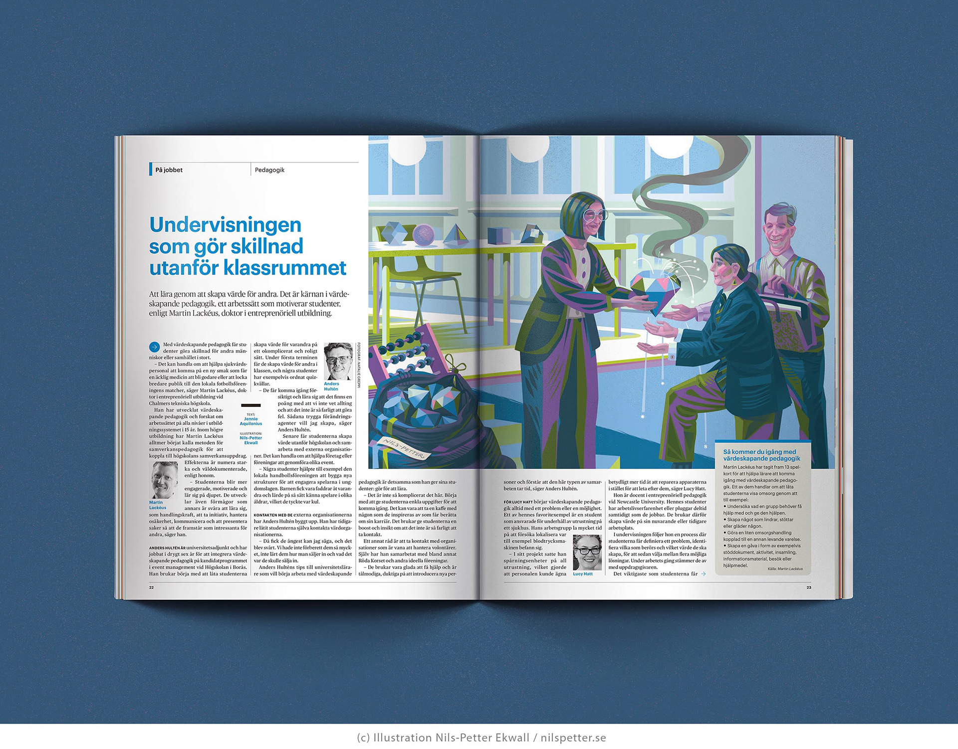
The final illustration as published in the magazine spread. I kept the centre fold in mind when designing the composition, making sure no important details would get lost. So I was happy to see that the final result worked as intended. Hope you like it too!