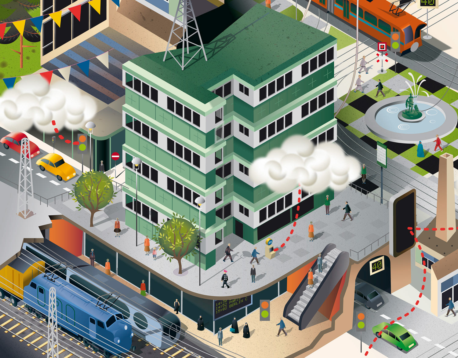
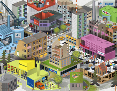
Nils-Petter was commissioned by an International Charitable Organization to produce a series of highly detailed landscapes depicting the organization’s international programs.
The client is a non-religious, grant-making philanthropic foundation. Committing its resources to address issues of global, social and environmental concern, particularly those that have a major impact on the lives of the disadvantaged. With offices in Geneva, London, Copenhagen, Sofia, Zimbabwe, India and North America they give grants to organisations in approximately 40 countries worldwide.
The client was seeking a unique visual style across all of its communication tools and material that could communicate the organizations international program strategies, processes as well as the overall values. Up to recently, there had been limitations in the design process and few design guidelines existed in the organization which had opened the door to a wide range of graphical styles across the communication material.
In total 13 landscape illustrations where to be made - one for each of the client’s international programs; Brazil, Denmark, Environment: Climate Change, Environment: Marine Conservation, Environment: Wildlife Conservation & Trade, Housing & Homelessness, India, International Human Rights, Issues Affecting Women, Learning Differences, Prevent Child Sexual Abuse, Special Interests and Zimbabwe.
In 2021 some of the landscapes where redrawn and a combined Environment landscape was added to the list.
The client briefing for each program was a bit enormous at first. In an initial stage it consisted of whiteboard brainstorm drawings from each program's meetings with about 50–80 scenes and a handful of environments per landscape. After a lot of hard work this was boiled down to a bit more manageable amount; about 20–30 specific scenes per landscape. In addition to this, some landscapes contained diametrically opposite settings; for example ”deep forest", "countryside", "village" and "big city". Or "beach", "fishing village", "city", "ocean ". Leading to one of the illustrator's most difficult tasks for this project - to actually make every scene and setting fit in each landscape.
In the case of Brazil, (above) this landscape was supposed to resemble coastal city of Recife - with a variety of scenes in different kinds of neighborhoods. The illustrator solved it by giving each district one or two building in the illustration. Here, much of the illustrator’s research work involved orienting himself in Recife in Google Street view to capture the city's architecture and the typical run-down environments with tons of Pichação (graffiti) and grit. Landmarks seen in the final illustration; Porto Digital and Ponte Estaiada da Via Mangue.
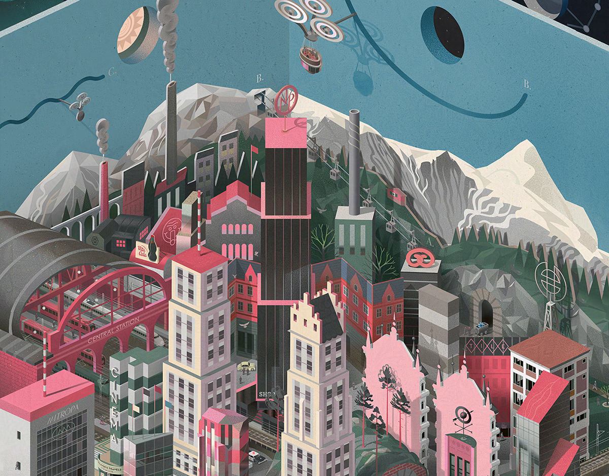
A similar research work was done with the Denmark landscape (above). But not with as much confusion - as a southern Swede - the illustrator had visited Copenhagen on several occasions. Here, too, the neighborhoods were simplified into a handful of houses and landmarks; Vesterbro, Apostelkirken, Rikshospitalet, Enghaveparken and Nyhavn to name a few. The Greenland part of the brief was turned into something that looked like a giant mural in the middle of Copenhagen. This technique of forcing a scenery with landmarks and a a visible horizon line into an isometric perspective by placing the scenery on murals or foundations became a recurring method throughout the project.
In opposite to Brazil and Denmark the India landscape (above) didn’t have a specific location more than somewhere in Jharkhand or West Bengal. This was one of the landscapes that required more rethinking when it came to inclusion of all different settings; ”a rural forest village”, ”urban town”, ”city” and ”fishing village near the river”, ”tea plantation” and ”farmlands”.
The Issues affecting Women landscape (above) didn't have any specific geographical location at all - but in the first version two superheroines resembling Frida Kahlo and Rosie the Riveter was flying over the city so the illustrator gave the illustration a twist of romantic 40–50’s South American / Cuban / Americana feel.
Zimbabwe - shows a mining village with houses and huts with a lot of activities (above). A communal farm, a school, several Baobab trees, an orphanage, health clinic, and a city view inspired by City of Harare, a rural landscape and Sir Humphrey Gibbs Training School to name a few.
Special Interest - (above) one of the more dynamic landscapes because of the this program’s wide range of contrasting focus areas - art, culture and science - together, almost forming a bouquet of different kinds of objects and buildings. Due to change of focus areas in this program - a new greener version of this illustration was made in 2021.
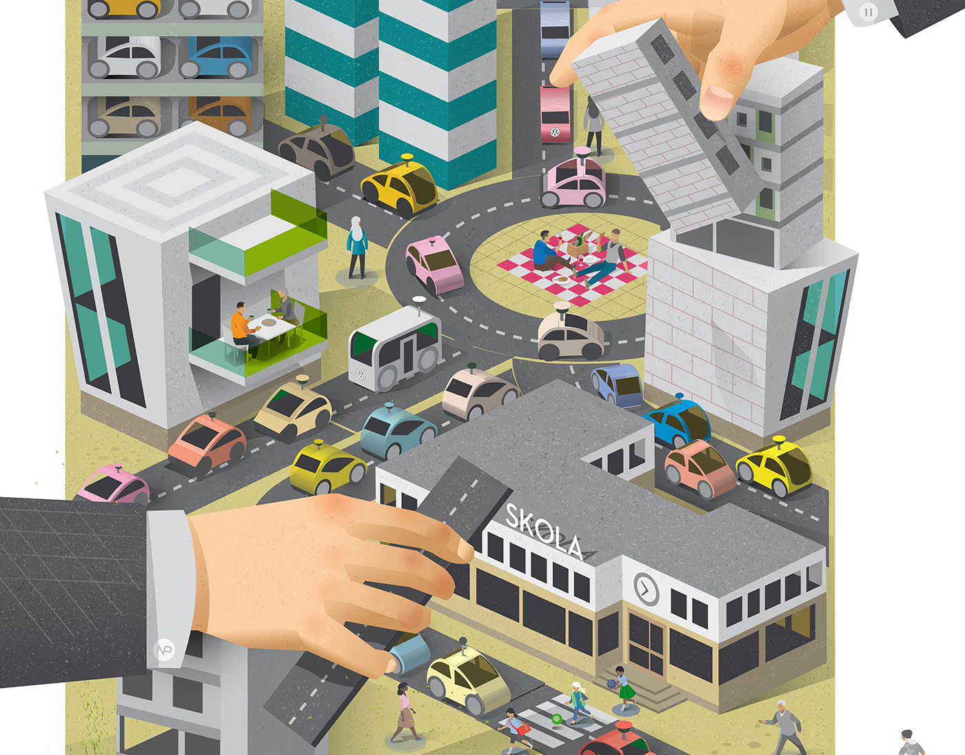
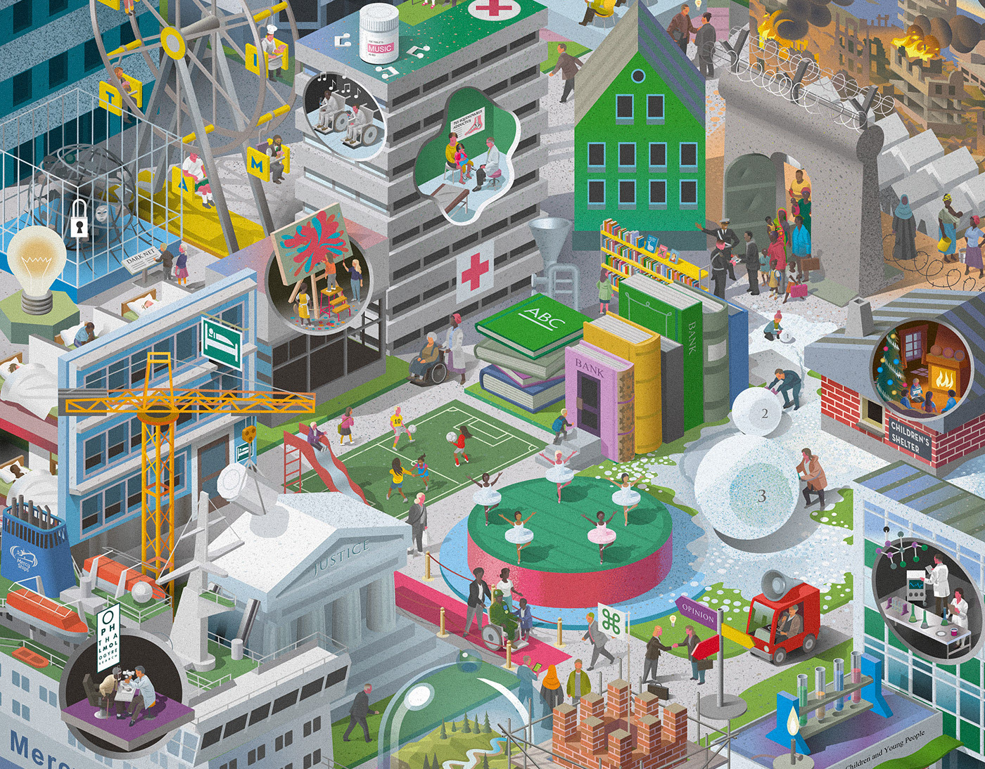
Housing & Homelessness (above). The first version of this landscape showed demolition of homes and was slightly more dynamic with skyscrapers and cranes lifting houses towards the sky. Also the first idea was to set this landscape in autumn with bad weather and rain‚ adding contrast to the warm cosey homes vs problems regarding homelessness - but this direction was partly abandoned. Changes in this program's focus areas - leaning towards people working together in communities rather than housing - led to the making of a new landscape in 2021.
International Human Rights - in it's first version this landscape showed demonstrations and police brutality. It was reworked into a more harmonic landscape in 2021 (above).
Marine Conservation, (above) Wildlife Conservation & Trade, Climate Change and three environmental programs that later was reworked and combined into one single landscape. For this version the illustrator worked heavily with flat decors and scenery to try to separate and build up the distance between the three different locations.
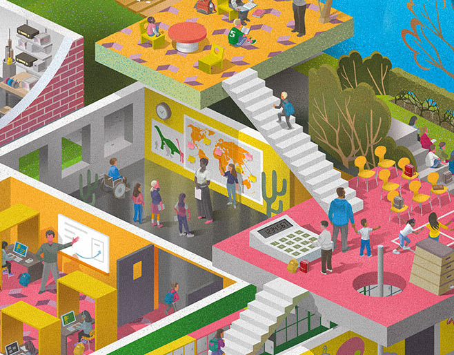
Learning Differences (above) shows a complex school building with different classrooms. Stairs leading to different levels of learning. (The stairs leading out of the picture leads to higher education.) Outside the school there is a city hall with demonstrators and a Neuroscience laboratory which was changed to an Innovation Lab in 2021. A scene showing children studying from home during Covid-19 was also added.
Illustrations for annual reports;
Spot illustrations;
